AOL is dead. Long live Aol.

AOL today unveiled its new branding, and people are less than impressed.
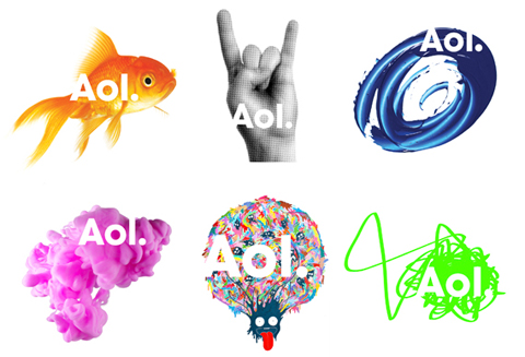
The new corporate identity, created by hotshot design agency Wolff Olins New York, involves using a set of hundreds of different backgrounds to sit behind the new mark in which AOL is written Aol. (don’t forget the full-stop).
Landing on this design was the result of a long and winding road which included research, testing, and creative reviews, all to answer the question, “should we even stick with the AOL brand?”
After studying research conducted by the Leo Burnett unit of the Publicis Groupe, which AOL hired in September; discussing the issue with employees and advertisers; and reading “a lot of e-mails from consumers,” Mr. Armstrong said, the company decided to keep the name. It is “one of the most powerful brands on the planet,” he said, albeit one that “needs updating, that needs to work on products and services” deemed more relevant to today’s Internet users.
“AOL is a turnaround situation,” Mr. Armstrong said on Friday in a telephone interview. “It will take every ounce of blood, sweat and tears to make it successful.” (New York Times)
Despite proof-of-concept videos like this one, the attempt to prove that Aol. is not your Father’s internet has been met with negative feedback from the design community the likes of which we haven’t seen since Tropicana took the straw out of the orange.
“Not since AT&T gobbled up Cingular and rebranded as at&t with that ugly Death Star-like logo has a company erred so far from sensibility” says Joe Wilcox of BetaNews.
“While preparing to massively lay off its employees, AOL (sorry, Aol.) announced a rebranding that looks… erm… Microsofpaintesque!” says Mirko of DesignerDaily.
“What do goldfish, four abstract scrawls and an obscene hand gesture have in common?” asks Nick Clark of The Independent, referring to the “Rock Hands” gesture which, in Italy, is a symbol for a cheating wife.
Of course all design is subjective, and the new Aol. logo’s approval will link to its efficacy. If sales and brand awareness increase, then the logo was effective regardless of public opinion. If sales tank, then the people were right and it was the logo’s fault.
WE want to hear your thoughts. What do you think of the new Aol. logo? Leave your opinions in the comments below.
.


